GunderFish Outbreak Model
Design Details and Algorithm Specification
The effects of a disease outbreak are often devastating to the region affected and often seem inexplicable to the general population. The GunderFish Outbreak Model is an attempt to give a basic understanding of the disease spread process to a non-technically trained person. This paper is aimed at the technically trained individual who wants a better understanding of the internal workings of the simulator.
The paper is organized as follows:
The XSD (eXplore Social Distancing) simulator model is designed as a tool to explore the effects of social distancing and quarantine controls applied to a disease outbreak.
It builds a population and tracks the transitions of groups of people (cohorts) as they are exposed, become infected, show symptoms and spread the disease, until they have a resolution – either recovering or (in the case of a potentially fatal disease) they die from the infection.
The model provides the ability to describe the characteristics of an infectious disease and to describe the ‘cultural’ components of a population. These cultural components include things like how gregarious they are (how many people do they have close contact with on a daily basis), how responsible they are (do they tend to stay home if they are sick, or do they keep going to work), and other social aspects that mark the difference, say, between a New York office worker and a rural Colorado accountant.
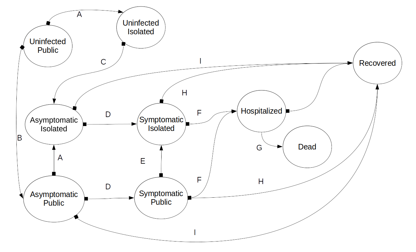
We are representing the affected population of a location with a Transition Graph model. This model consists of nodes and edges. The nodes represent a specific state, and the data of how many individuals are in the state at the current period. The edges represent the allowed transitions from one node to another.
The states are:
The model has a set of transitions representing the progression of the disease and the response of individuals to the disease. In Illustration 1, these are shown as the arrows labeled A-K. The semantics of the transitions are:
The details of these transitions are covered in Section 2.3.
The basic model tracks the transitions in the state of the people being modeled. The complete flow is shown in Illustration 1. It focuses on the progression of the disease through the population, by modeling the disease states (uninfected, asymptomatic, symptomatic, recovered, dead) and the accessibility (public, isolated) of the individual. The disease is modeled with descriptive parameters (transmission rate, time to symptoms, time to resolution, probability of symptoms, etc.). The social/cultural aspects ( average number of close contacts per period, likelihood of self isolation, etc.) of the subject population are also parameterized.
The model is a transition graph automaton, with a fixed transition period. The nodes (see Illustration 1) represent the number of people in each state in the current period. However, rather that representing these people as a single count (e.g., 45,000 people are infected) we must also keep track of when these people entered the state.
This need to track when the separate populations entered the state is why a simple Markov model cannot be used. The Markov model requires ‘path independence’ of the members in a given state. This model retains path information in the form of time of entry in order to properly progress from one period to the next.
Since the disease has a relatively fixed progression, for example 6 days from infection to showing symptoms, we need to know that of the 45,000 people in the example above, 2000 were infected 5 days ago, 6000 were infected 4 days ago, etc. Only the group that was infected 5 days ago will be suitable for transition to ‘symptomatic’ during this period. We represent these sub-populations as cohorts of the number of individuals and the times at which significant transitions occur.
Each period, each of the cohorts, in each of the nodes (the state) is analyzed, and portions are transitioned into the appropriate state for the next period. For example, the uninfected public count is assessed by the various disease-specific and cultural-specific parameters and the model determines how many of the uninfected become infected. These are added to the asymptomatic public node as a new cohort, with the appropriate ‘time of infection’ included. This newly infected cohort is removed from the uninfected public node and added to the asymptomatic public node. They are added to the asymptomatic public node because they have not yet begun to show symptoms. The portion of the original uninfected public cohort that did not get infected is represented by reducing the uninfected cohort count.
Illustration 1: Basic Transition Graph Automata Flow model for a disease outbreak.
The basic flow ordering is:
The specific parameter definitions and transition equations are described in the next section, and the algorithm is presented in more detail in Section 2.4
These are the algorithms that enable the model to predict the state of the entire population at the next time step. Note that may of these are dependent on the results of a previous calculation, so they must be done in order.
This algorithm was coded in Java, with a PHP and Javascript front end.
Transmission rate: In this model we use an R per day rather than the more traditional R0, where
An estimate of the Rt can be found by analyzing the first deaths in the outbreak. The infections that caused these deaths will have occurred before the public became alarmed and should therefore represent the Rt of that population in its normal state. The model approximated the death rate in Denver if the Rt was set at 0.224. We researched the contact rate of a medium sized city, and estimated Denver's contact rate at 32 people/day. We also assumed a small pre-infection self isolation rate (95%) (Mostly people who were watching the news from China). This resulted in a transmission rate of 0.007 infections per contact. Note that, assuming a transmission time in the population of 10 days, this results in a R0 of 1.85.
Initial Cohort size: We estimated the inital population by comparing the death rate in the model to the actual death rates in Colorado. In order to validate the Covid death rates, we extracted excess death numbers from the CDC data on deaths. For the first 6 weeks of the epidemic, the excess death rates matched the reported Covid-19 death rates with an R2 of 0.90. Using the Imperioal College death rate of 1% of death from infection, we estimated that approximately 1000 people were infected in Colorado on March 1. The Imperial college paper showed an asymptomatic rate of 50%, so we split the initial cohort into equal symptomatic and asymptomatic cohorts.
Hospitalization rate: Using these numbers we ran the model and compared the predicted hospitalizations to the actual hospitalization rates in Colorado. We discovered an infection to hospitalization rate of 4.2% in Colorado. Note that this is half as much as the 8.8% reported by the Imperial College paper in Wuhan. This may be a result of differing health care systems.
Hospitalization to death rate: By experimentation with the model, we derive a hospitalization to death ration of 31%. In the early stages of the infection, this number was significantly higher, but it stablized to this value after approximately 60 days
The initial timing values are taken from the Imperial College paper. Once the state began to apply social controls, we were able to estimate the timing of of hospitalization and death for Colorado more accurately.
In this model there are four social controls
The simulator allows the operator to set up a sequence of responses to be enacted at specific times. It then produces a graph of the expected hospitalizations that would result. After connecting to the simulator, the operator sets up their response plan using the sliders in the setup table. Once the simulation is correctly configured, the operator simply presses the ‘run simulation’ button. The simulation executes and the resulting graph showing day by day hospitalization needs is presented.
The simplest thing to do is nothing. In this case, the Governor of the state decides that no response policy is the correct response. The results are shown in Illustration 2, indicating that nearly 25,000 people required hospitalization on day 44. The horizontal blue line indicates the available hospital capacity of only 10,000 beds. This is not good – it indicates a lot of people dying due to the lack of hospital care.

Illustration 2: Effect of No Response to the Outbreak, approximately 25,000 people need hospitalization, overwhelming the healthcare system.
In this example, the governor responds to the outbreak after about 2 weeks of discussions and planning. She imposes a 45 day full “Stay at Home” order, which is released on day 60. This results in a lower peak hospitalization maximum (about 21,000) and it gives the state an extra 45 days to prepare. This time can be used to prepare additional hospital beds, or take other actions.
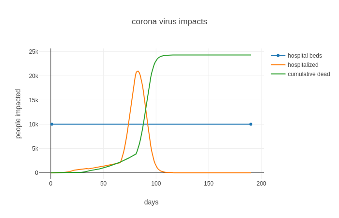
Illustration 3: In this simulation, the state is ordered on "Stay-at-Home" for 45 days, then released. The Peak is now at day 83, and is just over 20,000
At this point the model is using deterministic transitions, using mean values for the parameters, these will be expanded to use distribution values to facilitate the use of Monte-Carlo modeling.
The current model stops at the transition to symptomatic states, the model will be expanded to track transitions to include hospitalized, critical, and ICU states.
The current model does not include age distributions.
Additional work needs to be done on the social distancing in different cultures and under different condition.
We are in the process of ground-truthing the model. One of the challenges of training a model while the data are still being collected is that the data are often incomplete and are frequently inaccurate. A second challenge is that in the early stages of an outbreak, the availability of data is problematic. As more data become available, and as older data are corrected the model must often be ‘re-calibrated’ to correct for errors. This is an on-going problem with the COVID-19 outbreak.
Ferguson, Neil M., et al (2020, March 16). Impact of non-pharmaceutical interventions (NPIs) to reduce COVID-19 mortality and healthcare demand. Imperial College COVID-19 Response Team. https://www.imperial.ac.uk/media/imperial-college/medicine/sph/ide/gida-fellowships/Imperial-College-COVID19-NPI-modelling-16-03-2020.pdf
Mitse, Timo, et al (2020, June). Face Masks Considerably Reduce COVID-19 Cases in Germany:A Synthetic Control Method Approach. IZA – Institute of Labor Economics. http://ftp.iza.org/dp13319.pdf
Kai, De, et al (2020, April). Universal Masking is Urgent in the COVID-19 Pandemic:SEIR and Agent Based Models, Empirical Validation,Policy Recommendations. preprint. https://arxiv.org/pdf/2004.13553.pdf
If you want to discuss the details with us, use this link to send a message directly to the team at GunderFish. Contact GunderFish
GunderFish publication date 09 April 2020